“Practical Data” is an occasional series of articles that examines metrics that we encounter in our everyday lives. I take it as axiomatic that government statistics are created and reported to support a political narrative, whatever the narrative happens to be at the time.
Data Quality provides an excellent framework for understanding these metrics, allowing us to better differentiate between insights, propaganda, and conspiracy theories.
The focus today is inflation. We’ve all been feeling it. Most everything is more expensive. In some cases, much more expensive: gasoline, airfare, groceries, eggs, and insurance to name a few. And where the price hasn’t increased, the package sizes have decreased (a.k.a. shrinkflation).
We know from our introductory college Economics courses that inflation occurs most commonly:
- when the demand for products and services exceeds their supply
- when the cost of producing products and services increases (e.g. increased labor, fuel, and/or raw material costs)
- when the amount of money in circulation increases and/or the currency loses value
Inflation itself is not necessarily a bad thing. Like alcohol, sun exposure, sugar, and social media, a little bit is good but too much can be harmful. By the way, negative inflation rates (i.e. deflation) is also harmful. Experts differ on the optimal inflation rate, but 2% is the target for the U.S. Federal Reserve.
There is no shortage of opinions about the policy and political causes and remedies. That’s not my purpose here. Instead, I’ll focus on two practical considerations:
- the common confusion between changes in inflation rates and changes in prices
- an examination of the most commonly reported inflation metric through the prism of data quality
Tracking the inflation rate over time can be a little misleading because inflation itself measures the rate of change. It’s a comparison between two data points over a period of time, usually the current and previous month, or the current and previous year. For those who like math it’s the first derivative of cost with respect to time. For those who like physics it’s analogous to velocity.
If you enjoy looking at data and reports and graphs and stuff like that—and if you’re reading this you probably do—I highly recommend the Trading Economics website. The graphs in this article were generated using U.S. Bureau of Labor Statistics (BLS) data plotted on that website.
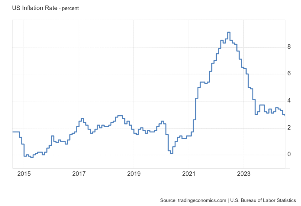
The first graph below shows the monthly year-over-year inflation rate from January 2000 to August 2024.
The inflation rate began to spike in Spring 2021, peaked in June 2022, decreased rapidly over the next year, and has been holding steady since then. From the shape of the graph, one might reasonably expect to see prices returning to more reasonable pre-2021 levels but this is clearly not our first-hand experience. Why?
Because that graph shows the rate at which prices are increasing and not the prices themselves.
The impact of inflation on price is like a ratchet.
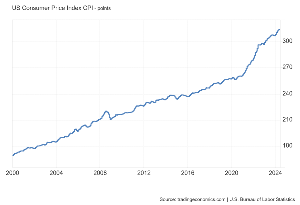
A decreasing inflation rate just means that prices are increasing less rapidly. Each month, prices increase relative to the previous higher price, which was an increase relative to the previous higher price, and so on. The 6% increase one month is on top of the 6.5% increase the previous month. The effect is compounded (kind of like compound interest, but not in a good way).
This second graph illustrates the impact of inflation on the prices we pay for goods and services, and reflects the price increases we’ve all been feeling. It shows the price increase in the market basket of products and services used to calculate the inflation rate. For the most part the prices have increased relatively steadily, except for a small bump at the time of the 2008-9 Great Recession, and a much larger bump starting in January 2021.
Oftentimes the so-called experts in the business press and news media add to the confusion. A Business Insider article had three bullet point takeaways below the headline. The first reads, “US grocery prices remain high despite cooling inflation.” The implication is that because the inflation rate is decreasing, food prices should be expected to decrease but they’re not. We now know that the high prices are exactly what we would expect. This fact is noted in the article, but not until the last page: “the higher [inflation] rates seen in recent years, especially in 2022, are still built into the prices paid at the store and are hitting consumers’ wallets hard.”


Now that we’ve got a common baseline understanding of how inflation works, let’s look at how it’s measured and reported.
The data collection and calculation processes used by the Bureau of Labor Statistics (BLS) to measure inflation are complex. This is partly because they have evolved over nearly 75 years and partly because specific constituencies need slightly different report variations. Sound familiar? Nevertheless, the Bureau of Labor Statistics does an excellent job documenting the data content and methodology. And unlike other government statistics (unemployment and job reports come to mind), revisions are relatively infrequent, generally localized, and usually minor.
The most commonly reported measure of inflation is the Consumer Price Index (CPI). When someone refers to the “inflation rate” this is almost certainly what they’re talking about.
Sort of.
Really what they mean is the change in the Consumer Price index, either month-over-month or year-over-year. Even the Bureau of Labor Statistics defines the Consumer Price Index as a delta.
On the other hand, the Trading Economics website differentiates between CPI (the absolute number) and Inflation Rate (the change over time). We are going to define CPI as the absolute number in our analysis.
Let’s dive in.
Completeness
Are all instances collected and included in the metric?
If not, how is the subset selected and does it represent a representative cross-section?
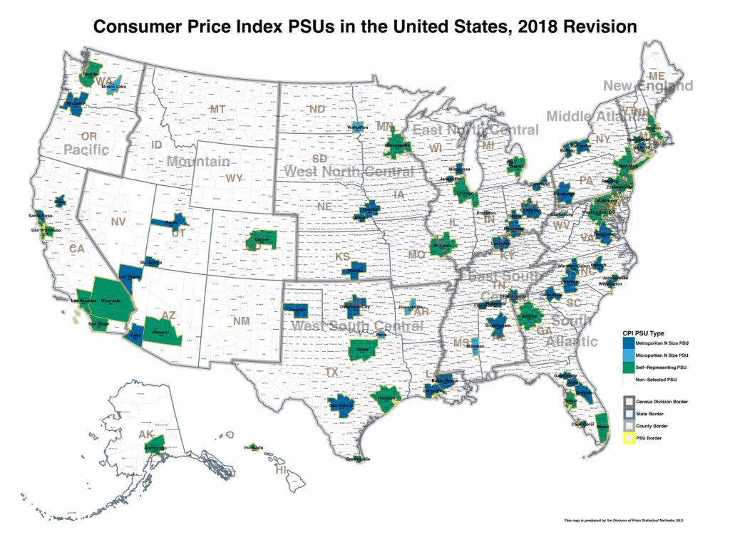
The CPI is made up of a market basket of approximately 94,000 goods and services intended to represent what Americans buy in their everyday lives. Items like gasoline, apples, cable TV, and doctor visits. Pricing data is collected every month or every other month from 23,000 retail establishments in 75 urban areas. Also factored into the calculation are 8,000 housing unit quotes, since housing is one of the categories. Obviously not every product and service from every location can be included, but the list of items included in the CPI is very complete and very well documented.
The composition of the market basket is determined using three surveys conducted by the U.S. Census Bureau: the Customer Expenditure, Commodity and Services, and Housing Surveys. The Consumer Expenditure Survey, for instance, collects information about the items that people are actually purchasing. This data is also used to weight the items in the overall index (we’ll come back to this shortly).
Seems pretty complete, but there’s a blind spot in the data. Did you catch it?

Lineage
Where does the underlying data come from?
The Bureau of Labor Statistics collects the data primarily through personal visits and telephone calls to retail outlets.
Accuracy
What exactly is the statistic measuring?
What is it trying to communicate?
How close is the underlying data collected and recorded to the real-world instances of the objects or phenomena?
The goal of the CPI is to “measure of the average change over time in the prices paid by urban consumers for a market basket of consumer goods and services.” The data collected are actual prices, so it is reasonable to conclude that the data would be very close to the real-world experience of urban consumers.
Precision
Is the underlying data collected sufficiently fine-grained to accurately represent the instances?
The market basket list shows the categories, and the data collectors record price data for the precisely defined product or service priced the previous month.
Consolidation
How is the data accumulated, aggregated, summarized, and manipulated?
Each product and service category is weighted according to its relative importance to consumers using the data from the Consumer Expenditure Survey. For example, Americans spend more on chicken than on tofu, so changes in the price of chicken have a greater impact on the CPI. At the top of the list is housing at 45.141%. Toward the bottom is frozen noncarbonated juices and drinks at 0.009%.
If you’re interested, you can download the data (click on the CPI-U link for the most recent month) and experiment with your own weights.
Here comes another wrinkle. The CPI is published both with and without a seasonal adjustment. The adjustments are made for the previous year and used to revise the past five years of seasonally adjusted data. The idea is to try to minimize the impacts to price movements due to well-known and predictable events such as weather, production cycles, and holidays.
Consistency
Is the same data collected in the same way from the same sources from period to period?
Are the calculations and adjustments the same period to period? If not, how do they differ?
Are the metrics adjusted or do they evolve over time? What triggers an adjustment?
What is different about the new data? Where did it come from?
Like the Dow Jones Industrial Average (DJIA) examined in an earlier Practical Data article, the Consumer Price Index is designed to be as consistent as possible through time. The data collection methods are generally consistent, and the sample size is large enough to minimize the impact of errors. Of course, with any large, dynamic data set, sometimes errors occur and need to be corrected, and sometimes manual adjustments are necessary.
The data collectors look to record the prices of the same goods and services each month. The 13.5-ounce box of Frosted Flakes or the Joseph A Bank Traveler sport coat. But sometimes items go in and out of fashion. Sometimes a specific item may no longer be available, or has been replaced in terms of size, content, or quality. The data collectors try to replace them with comparable items, and experts in that product domain may make adjustments to the index to negate the impact of the change. Updates to the market basket categories are rarer.
Also, like the DJIA, the CPI spending weights are periodically updated, in this case annually from the Census Bureau survey data collected two years prior. The weighting also differs between index variations.
Speaking of different inflation index variations, the government produces a dizzying array of inflation statistics. You can explore many of them at the Trading Economics website. Most are generated using the same data and the same methods, but it’s still best to double check to make sure you understand exactly what you’re seeing.
The most commonly reported indices are:
- Consumer Price Index (CPI or CPI-U; the U is for Urban; this is usually what is meant when someone refers to the “inflation rate”)
- Core Consumer Price Index (Core CPI)
- Producer Price Index (PPI, sometimes referred to as wholesale inflation)
- Core Producer Price Index (Core PPI)
- CPI-W (CPI for hourly wage earners and clerical workers which is mainly used to adjust Social Security payments)
The Core CPI and Core PPI do not include energy and food prices because they are more volatile. This strikes me as curious, though, because energy and food prices have a greater impact on people’s finances than just about anything else. So, check out the Food Inflation and Energy Inflation reports. Does it seem like it’s more expensive to travel? The CPI Transportation report confirms that. Just be sure that you understand whether you’re looking at the raw cost, rate of change from the previous year, or the change in the rate of change from the previous month.
Not surprisingly, economists argue over which is the best measure of inflation. The hair can be split in many different ways, but the fact is that no aggregate, sampled, or scaled metric is going to reflect everyone’s experience.
When you hear someone talking about an inflation report, be sure you know which index they’re referring to.
Ask yourself why you’re hearing about that “flavor” and not some other one. Is it the CPI-U, CPI-W, or PPI? Is it “core” that excludes food and energy prices? Why not report the metric that includes those costs? Has it been seasonally adjusted? Are you in a targeted urban area or are your purchasing patterns sufficiently different to deviate from the published value?
Try to determine which narrative it’s supporting or contradicting. Understand what’s included and not included.
Be a data skeptic. Don’t be a sheep.


